
Overview
Context
By the end of January 2026, AI tools like Claude code, cursor and other AI agents became an integral part of Commenda. Everyone was trying their hands on ideating, prototyping, testing and then finally trying to ship things out on their own.
Target users for Agent App
Problem
Now that building has become accessible to all, design was becoming a blocker here. While prototyping, people were not able to use our design system components. Also, even if you give a handoff ready figma design to an LLM, it still hallucinates a lot.
You describe a component, the AI builds it, it looks good. You describe another one, that looks good too. By the end of the session, you've got 15 components and a layout that feels professional. But what actually happened under the surface is that the AI made somewhere between 200 and 300 visual micro-decisions during that session.
It also does not keep record of the past micro-decisions that it made to set the padding, spacing, typography etc. Eventually things start feeling off. And it becomes really a headache to fix it because on the surface level it kinda looks okayish but only a designer will tell you what's exactly off.
So I took upon this project to make our design system scalable across AI agents, code and prototype. So that anyone can just pick up atoms, modules and all the pre-defined tokens and variables from the system directly and ship the feature.
I took inspiration from Hardik Pandya, and Intercom's design team
The existing system
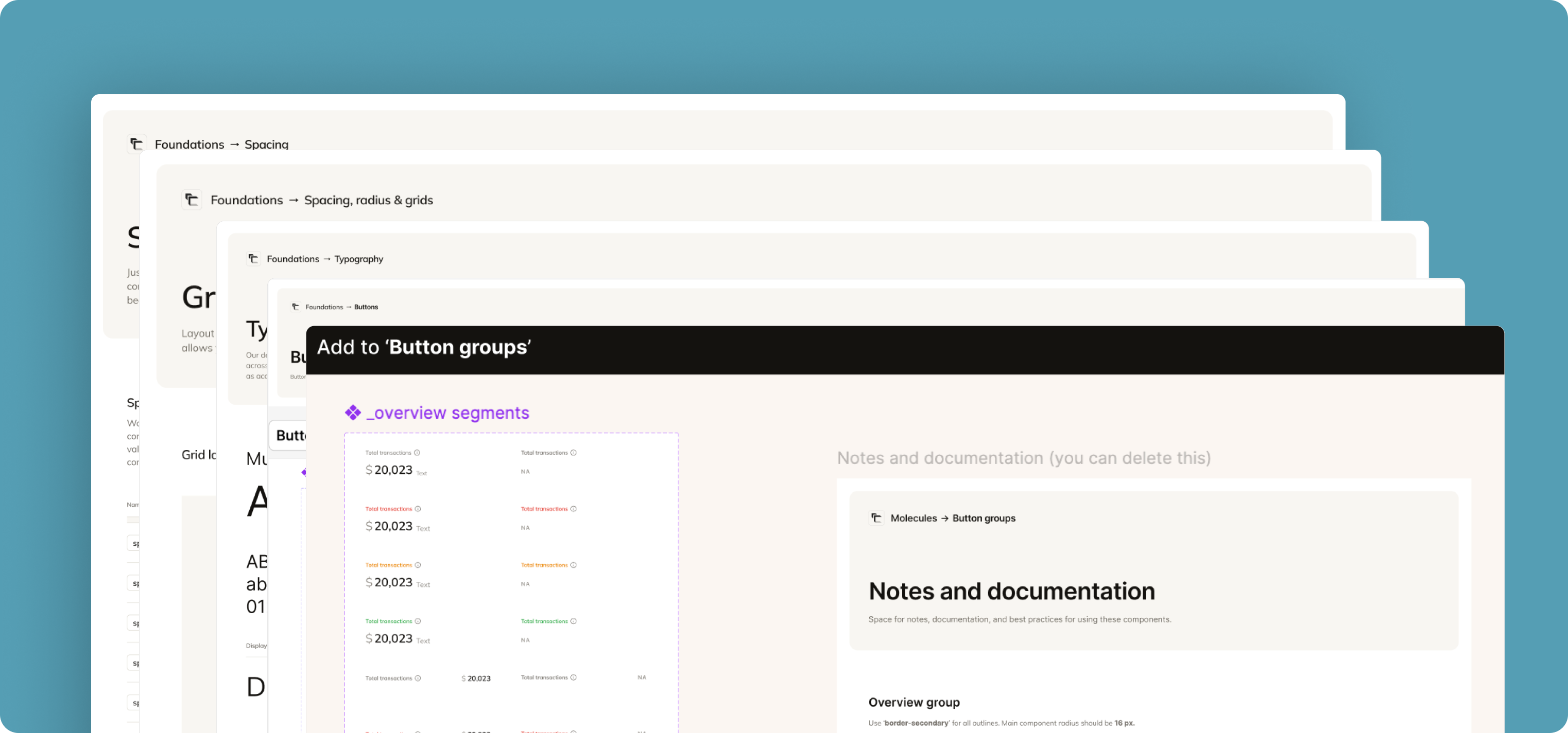
1. Preparing the Design System
Reduced redundancy (merged similar components)
Standardized naming (strict, predictable patterns)
Flattened structure (removed unnecessary nesting)
Removed unused/dead components

Earlier we had so many unnecessary states and variants for components like input fields, buttons, dropdowns etc. I sat down and brainstormed on how to optimize the variants to have the minimum amount of variants for each component.
Before:
After:
2. Syncing with Code Library
I sat with our design engineer to audit and align Figma and code. The goals here were:
1:1 parity between design and code
No "design-only" or "code-only" components
We removed mismatched components, updated props to reflect actual usage, and ensured all tokens mapped correctly.
3. Feeding Tokens to Claude Code
We exposed tokens and components to Claude Code via:
Figma MCP
Codebase (cursor access)
Now, Claude could understand available components, compose UI using valid props, and avoid hallucinating styles.
Token structure:
Component definition (LLM-readable):
4. Auditing Components + Tokens
We tested with non-designers across teams, the product team, the the ops team, the customer success team.

Now, Claude could understand available components, compose UI using valid props, and avoid hallucinating styles.
Example output:
Impact
Saved per session
on design for early prototypes